AuroraWatch UK geomagnetic activity index
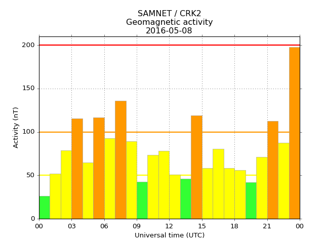
AuroraWatch UK produces an hourly activity index to measure “geomagnetic activity” which we use to estimate the likelihood that aurora can be seen from the UK. The value for the current hour is updated every 3 minutes based on the available data. For this reason the value is often low in the first few minutes of the hour and will increase later-on. An example plot showing geomagnetic activity computed from our Crooktree magnetometer is shown below.

The bars indicate the maximum level reached in each hour. They are coloured based on our alert levels. The latest data (normally relating to the current hour) is always shown in the right-hand side of the chart. Activity is recorded in nanotesla (nT) - a unit of measurement for magnetic field strength.
In addition to the activity bars the plot shows coloured horizontal lines which also correspond to the alert levels. The y axis scaling is adjusted to indicate the next highest alert level (yellow if all bars are green, amber if one or more yellow bars are present, or red if one of more amber bars are present).
The time is always shown in Coordinated Universal Time (UTC), which is the same as Greenwich Mean Time (GMT) or 1 hour behind British Summer Time (BST), and the date is in given in the format yyyy-mm-dd. Both the time and date formats are standard in scientific and computer-related fields.
The activity index is computed from the maximum of
- The maximum absolute combined disturbance of the H and E components of the magnetic field from the expected quiet-day curve value.
- The maximum hourly range of the H and E components.
Magnetograms
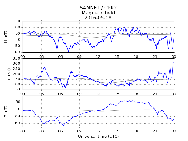
Magnetograms show the time variation of the magnetic field(s) recorded by a magnetometer. Measurements are typically made by a flux-gate magnetometer which measures the magnetic field in one direction only; often 3 sensors are used so that the magnetic field can be measured for all three orthogonal directions. Below is an example showing magnetic field variations measured by the SAMNET magnetometer at Crooktree.

The H-component (top panel) relates to the north-south component of the local magnetic field while the E-component (second panel) relates to the east-west component. The Z-component (bottom panel) relates to the field in the up-down direction and is not used when it comes to detecting aurora. Note: not all of our magnetometers record the magnetic field in three directions and so may only show the H-component.
The grey lines on each panel indicate the “quiet-day” curve. A line that roughly indicates what we’d expect the magnetic field to look like if there were no disturbances.
Stackplots
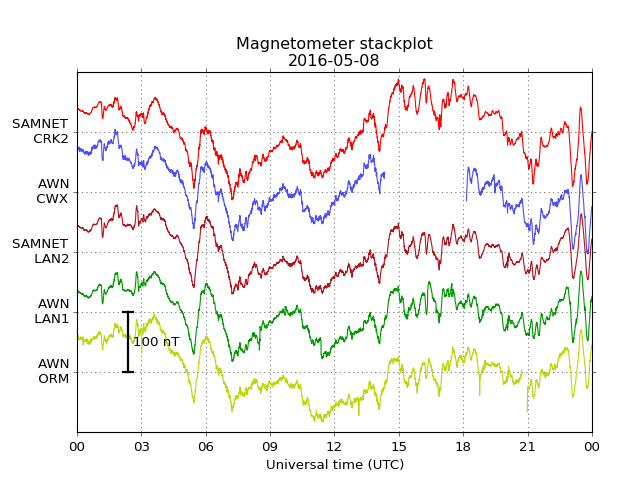
The stackplots show the time variation of the H-component of the magnetic field (top panel in the magnetograms) as recorded by several of our magnetometers.

The lines should all look quite similar, but you may notice some “blips” or missing data here or there in the various magnetometers due to local interference or down-time. Due to the ranges in geographic latitude (and, to a lesser extent, longitude) there may also be some differences in the field strength measured.
For more information about the various magnetometers shown, and for real-time data from each, visit our Plots page.


